SENIOR PRODUCT
& SYSTEMS DESIGNER
11 years designing product UX, learner workflows, scalable systems, and customer-facing digital experiences for technical education.
CASE STUDY
Redesigning Landing Pages for Campaign Conversion
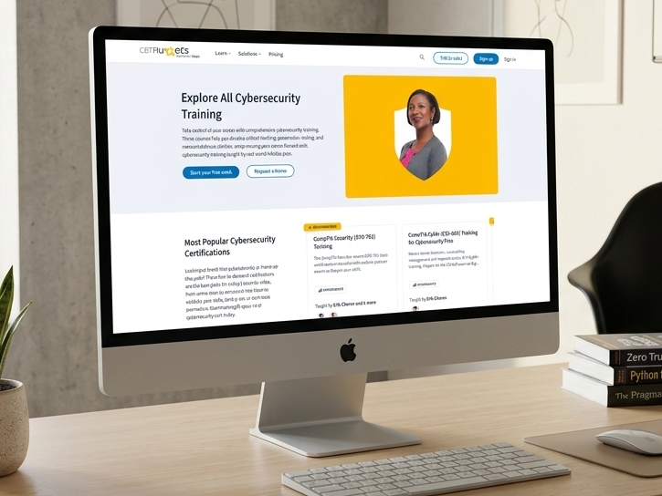
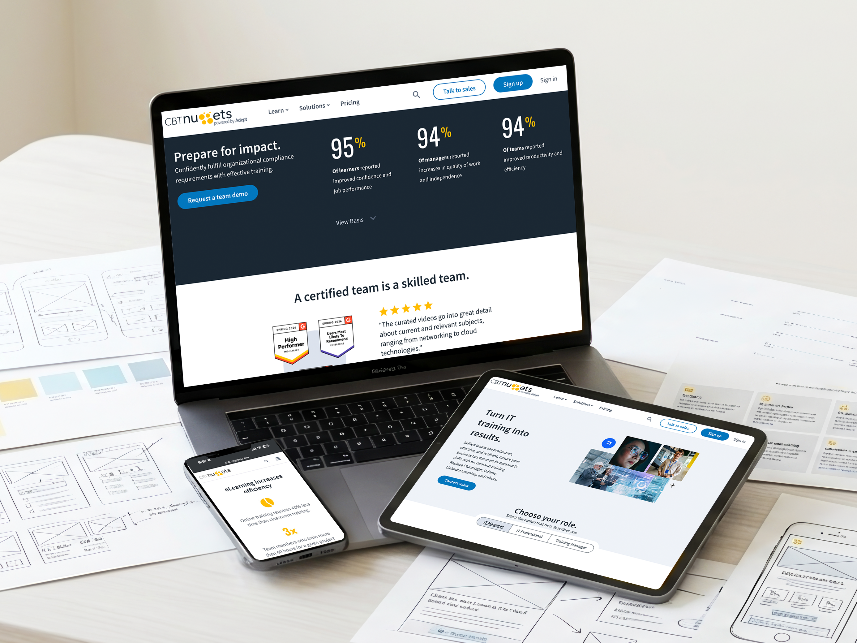
As CBT Nuggets expanded its lead generation efforts, the landing page experience became harder to scale and maintain. I worked with another designer to redesign the system around clearer conversion paths, reusable layouts, and faster content publishing through Contentful.
Executive Summary
The existing landing pages had grown disconnected over time. Blog traffic often routed users to the wrong destinations, layouts varied heavily from page to page, and teams were repeatedly rebuilding similar experiences from scratch. We redesigned the system to create more consistent conversion flows and reduce production overhead.
My Role
UX Designer, Co-Lead
I worked as a UX Designer alongside another designer, partnering with marketing, content, and developers throughout the project. My work focused on layout structure, CTA hierarchy, reusable patterns, conversion flow clarity, and improving how landing pages connected to the larger content journey.
01Strategy & Problem
Business Goals
- Improve lead generation across downloadable resources and training content
- Reduce duplicated work across landing page creation
- Speed up campaign production using reusable Contentful layouts
User Pain Points
- Users were being routed to disconnected or confusing destinations from blogs and campaigns
- Landing pages varied heavily in structure and behavior
- Important actions and downloadable resources were often difficult to find quickly
Starting Conditions
1,035
Q2 sessions before the redesign
Unlinked
Blog-to-landing-page paths
Inconsistent
Landing page structures across campaigns
Dev-supported
Publishing workflow before Contentful
Project Constraints
- The new system needed to support multiple training paths, certifications, and experience levels
- The layouts needed to stay flexible while remaining consistent
- The team wanted to reduce developer dependency by moving landing pages into Contentful
02Execution & Leadership
Research Synthesis
The project started after a bug reporting campaign where users tested the experience in exchange for free swag. The feedback exposed disconnects between blog content, landing pages, and conversion flows. We repeatedly saw users losing context as they moved between experiences.
Design Trade-offs
The biggest trade-off was flexibility versus control. We needed templates that were structured enough to keep pages consistent, but not so rigid that every campaign felt identical. The rules gave the team room to update content quickly while protecting hierarchy, layout quality, and conversion paths.
Collaboration
This project was highly collaborative between marketing, content, design, and developers. Developers helped establish the initial Contentful structure, while design and marketing worked closely together to improve hierarchy, conversion flow clarity, and scalability across campaigns.
What We Did
We moved the landing page workflow into Contentful using strictly defined templates, reusable modules, and editing rules. The team still relied on developers for initial setup and heavier technical needs, but day-to-day page creation and updates no longer required a full dev cycle. What used to take one to four weeks could often be completed in one to four days because marketing and design could build within the approved templates ourselves.
03Impact & Reflection
Measurable Results
+466%
Traffic growth QoQ
1,035 → 5,861
Sessions
192
Submissions
208
Asset downloads
Retrospective
This project reminded me that better UX is not only about what users see. It is also about how teams build and maintain the experience behind the scenes. Once the workflow became easier to manage, the public experience became more consistent too.
What I'd Do Differently
- Introduce user testing earlier in the redesign process
- Create stronger guidance around blog-to-landing-page pathways
- Build more post-launch tracking around where users dropped out of the funnel
CASE STUDY
Designing a High-Converting Lead Generation Funnel
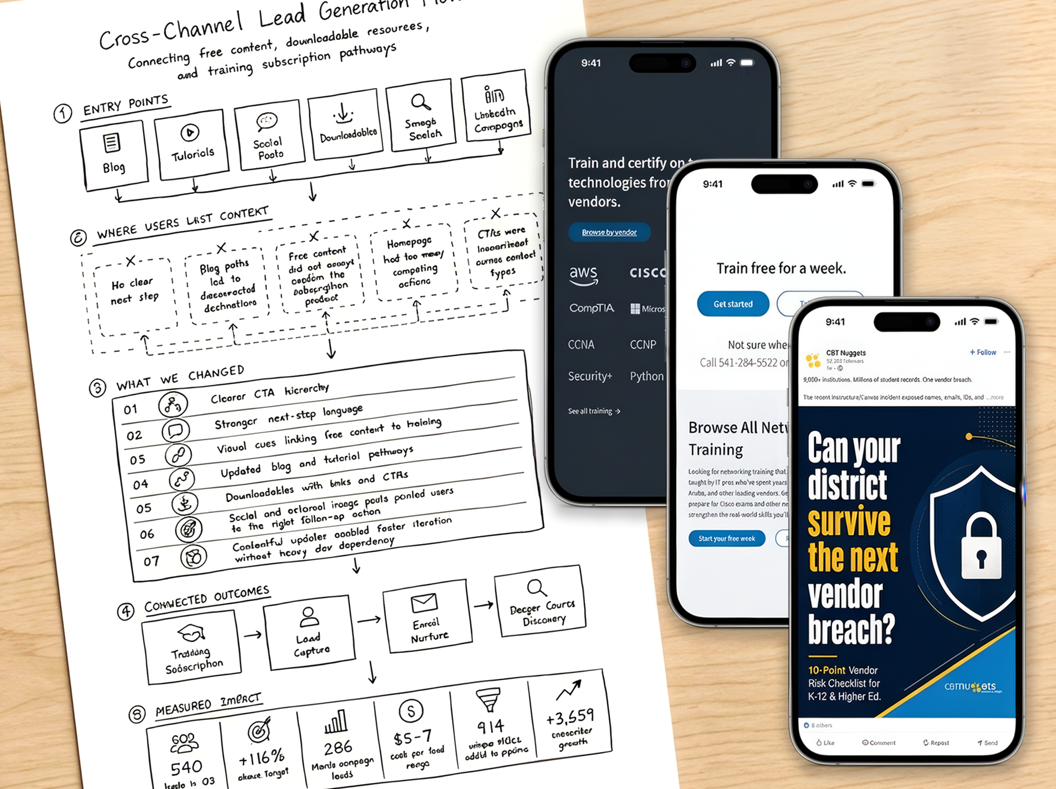
CBT Nuggets was expanding lead generation through downloadable resources, tutorials, LinkedIn campaigns, blogs, and free training content. The existing experience made it difficult for users to understand where to go next. We redesigned the flow around clearer next steps, stronger onboarding guidance, and more connected conversion paths.
Executive Summary
This project focused on improving how users moved between tutorials, blogs, downloadable resources, social campaigns, and training content. The redesign prioritized clearer user pathways, stronger CTA hierarchy, and more intentional onboarding flows so users always understood the next step in the experience.
My Role
I worked as a UX Designer alongside another designer, partnering with marketing, content, developers, and leadership throughout the project. My work focused on onboarding clarity, CTA hierarchy, content flow structure, conversion-focused layouts, responsive design, and reusable patterns that helped connect users more naturally across different content experiences.
01Strategy & Problem
Business Goals
- Improve lead generation across tutorials, downloadable resources, and training content
- Create clearer next-step guidance across channels
- Reduce friction between content discovery and conversion flows
User Pain Points
- Users often reached blogs or tutorials without clear next steps
- Social, tutorials, search, and web content frequently led to disconnected experiences
- The homepage contained too many competing actions and conflicting information
Starting Conditions
250
Q3 lead target
Disconnected
Cross-channel content flows
Inconsistent
User onboarding paths
Contentful
Rapid publishing with minimal dev dependency
Project Constraints
- The experience needed to support multiple content types and user intent levels
- Flows needed to stay flexible while remaining understandable and consistent across the entire experience
- Most updates needed to happen quickly inside Contentful without heavy developer involvement
02Execution & Leadership
Research Synthesis
We spent time looking at where users lost context between blogs, tutorials, downloadable resources, and conversion flows. Analytics, heat maps, and user feedback fed the design decisions. A major theme was orientation. Users often understood the individual content piece they landed on, but did not understand what to do next.
Design Trade-offs
One of the biggest challenges was balancing free value with product clarity. We wanted users to get helpful content without feeling trapped by aggressive CTAs, but we also needed the experience to clearly show that CBT Nuggets offered deeper training through subscriptions. The final approach kept free content useful while making the next step easier to understand.
Collaboration
This project involved close collaboration between marketing, content, design, and developers. Because the experience was already managed through Contentful, the team could iterate much faster and make structural changes without relying heavily on engineering support for every update.
What We Did
We leaned on the existing design system to simplify the homepage, clarify page hierarchy, and make calls to action easier to follow across the experience. Blog pages, downloadable resources, social posts, and external image links were updated with clearer language and visuals so users understood CBT Nuggets was a training subscription product, not just a source for free articles or quick downloads. The goal was to make every entry point clearly direct users somewhere useful, so those who wanted more of what they clicked could continue into training instead of leaving with only a free snippet.
03Impact & Reflection
Measurable Results
540
Leads in Q3
+116%
Above lead target
286
Q3 campaign leads
$5–7
Cost per lead range
914
Unique MQLs added to pipeline
+3,659
Subscriber growth
Retrospective
This project reinforced that users can like the content and still miss the product. The biggest improvement was not pushing harder. It was making the path clearer, so people understood where they were, what CBT Nuggets offered, and what to do if they wanted to keep learning.
What I'd Do Differently
- Simplify homepage decision-making even further
- Create stronger continuity between tutorials, blogs, and downloadable resources
- Add earlier signals to help users understand the value of the next step before reaching a form or CTA
PROJECT
Designing a Learning Experience for Both Sides of Training
Role
Lead UX and Visual Designer
Scope
Product UX, trainer workflows, content systems, reporting, and team learning tools.
Impact
Helped define the product foundation for learn.gg / LX2, a collaborative learning platform created within CBT Nuggets.
Context
Users
Signals
Constraints
PROJECT PROOF
Design proof across the core experience
Home
+
The strongest part of this project was not a single screen. It was the way the same product logic carried across learning, reporting, team collaboration, content creation, review, moderation, and career growth. Because the platform had to serve both learners and trainers, every major feature had to answer whether more capability could be added without making the experience harder to understand. This section breaks down the main design decisions, what informed them, and how they carried through the final experience.
Pain point
Learners needed access to progress, notes, chat, and reports, but every added feature risked pulling them away from the lesson.
Intent
Let users do more without losing their place in the training.
What I designed
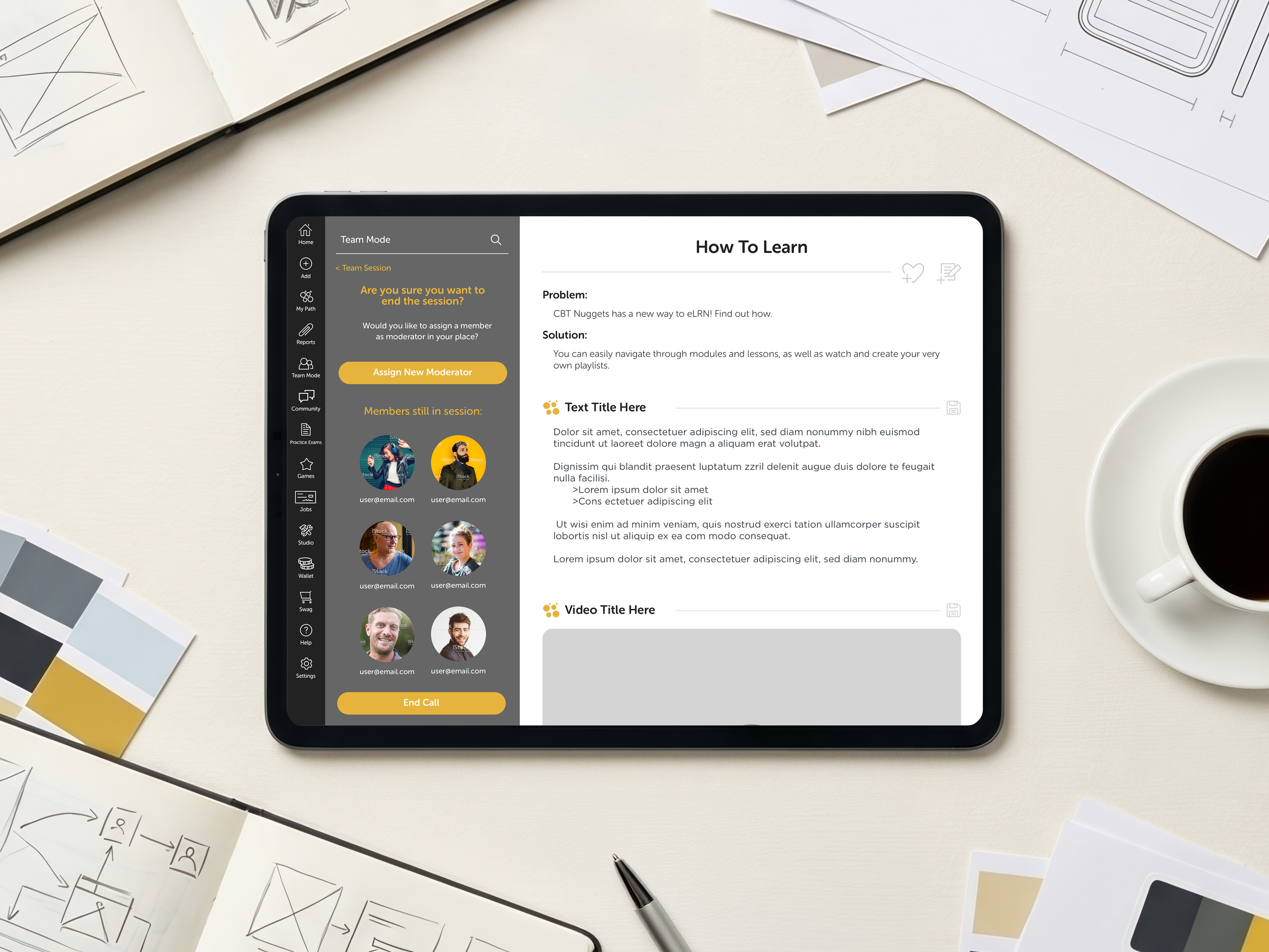
I kept the training experience anchored in the right two-thirds of the screen and placed secondary actions in the left one-third. That left panel could flex for navigation, notes, chat, reports, team tools, or trainer actions while the lesson remained visible.
Why
The lesson was the core experience. Everything else needed to extend it, not compete with it. By keeping training persistently visible, users could move through secondary tasks without feeling like they had exited the learning flow.
What worked
This split-screen model gave the product a clear organizing principle. It made the platform feel more powerful without making it feel scattered. Learners could reference the lesson while taking action, and trainers could build or review content while staying connected to the final learning experience.
Reports
+
Reports had to do more than show data. The experience needed to help learners understand their progress, recognize what they had already completed, and find the next useful step without feeling overwhelmed. This section shows how the reports flow organized accomplishments, scores, completed training, and deeper details into a structure learners could actually use.
Pain point
Most reporting tools focus on raw information, but technical learning is emotional too. Learners needed a way to see what they had accomplished, measure improvement over time, and feel encouraged to continue training instead of feeling buried in analytics.
Intent
Design a reporting experience that felt motivating, easy to navigate, and connected to the learner’s sense of progress.
What I designed
The flow focused on accomplishment first. Learners could review completed training, validated minutes, module progress, and practice exam scores, then compare results against past work. I created a reporting flow that moved from quick progress summaries into deeper details when needed. Learners could view completions, check scores, manage automated reports, and access more specific lesson or module data without the page feeling overloaded.
Why
Technical training can feel long and difficult, so the reports experience needed to create a sense of momentum. The goal was to make learners feel proud of the work they had already done while giving them useful next-step information. The structure became more focused as the flow evolved. Instead of showing every possible data point at once, the design prioritized high-level accomplishments first, then let learners drill into more detailed reporting when they needed it.
What worked
The final concept made reporting feel less like an admin area and more like a progress checkpoint. It gave learners a direct view of their effort, improvement, and completed training, which encouraged continued engagement.
Team Learning
+
Team Learning had to make shared training faster to manage without turning the learner experience into an admin tool. The goal was to enable collaboration, visibility, and accountability while keeping the lesson itself focused. This section shows how the team experience connected individual learning, shared progress, and group-level visibility inside the same product system.
Pain point
Group learning could easily turn the product into a meeting tool instead of a training experience. The flow needed to include live discussion, scheduling, video, audio, chat, moderators, public sessions, private sessions, and recurring study groups, but the lesson still had to remain the reason users were there.
Intent
Create a shared learning experience where users could join the same lesson, learn together, and manage the session without losing their place. The flows explored different ways to start, join, schedule, browse, or moderate a session for trainers, moderators, and participants.
What I designed
I designed the team learning experience around a flexible left-side workspace for chat, members, video controls, session options, scheduling, and moderation tools while keeping the lesson visible on the larger right side of the screen.
Why
The goal was to make collaboration feel like part of learning, not a distraction from it. As the flow expanded, it needed to account for public and private sessions, moderated and unmoderated groups, one-time and recurring sessions, and moderator actions like adding members, assigning another moderator, stepping down, or leaving a session open for volunteers.
What worked
The final concept gave Team Learning structure without making it rigid. It enabled casual study groups, trainer-led sessions, public discovery, private invites, and live collaboration while keeping the training page anchored. The lesson stayed central, and everything else worked around it.
Jobs
+
Jobs connected the learning experience to what users were working toward outside the platform. The goal was to make career growth feel tied to training, not separate from it. Because learners were building skills for real technical roles, the experience needed to help them understand how their progress could connect to job paths, role requirements, and next steps. It had to feel useful without turning the product into a job board. This section shows how the Jobs experience created a bridge between training progress, skill-building, and career direction.
Pain point
Most learning platforms stop at course completion. Learners can earn certifications or complete lessons, but they still have to figure out how to translate those accomplishments into something meaningful for employers. The goal of the Jobs experience was to bridge that gap.
Intent
Create career tools where learners could turn training progress, certifications, validated skills, and completed content into evidence for real job opportunities. The early flows connected learning data to resumes, expertise tracking, job comparison, opportunity search, and recommendations based on completed skills and certifications, while giving employers deeper proof of expertise beyond a traditional resume.
What I designed
I designed a career-focused experience that connected learning progress directly to professional growth. The system included resume-building tools, skill and certification tracking, expertise validation, job recommendations based on completed training, “almost qualified” job matching, suggested learning paths for missing skills, job comparison tools, resume export and sharing, portfolio attachments, badges, transcripts, certifications, and optional video introductions.
Why
The intent was to make learning feel connected to a larger outcome. Many users were training to improve their careers, qualify for new roles, or prove technical expertise, so the recommendation system helped them understand which jobs they qualified for now and what additional training could move them toward future opportunities. The employer side also explored how hiring managers could see deeper evidence of completed training and validated skills instead of relying only on static resumes.
What worked
As the flows evolved, the experience expanded from simple job listings into career tools focused on skill matching, certification alignment, close-skill gaps, flexible resumes, and possible employer integrations. The final concept positioned training progress, certifications, badges, and expertise as practical evidence learners could use for career decisions.
Trainer Studio
+
Trainer Studio became the operational backbone of the platform. It was not only a lesson editor, but a connected workflow system for assignment, creation, moderation, review, approval, and publishing. Because trainer work directly affected the learner experience, the creation tools needed to feel efficient, structured, and trustworthy.
Pain point
Trainer Studio had to handle much more than lesson editing. Trainers needed a workspace where they could receive assigned modules, create lessons, build different types of content, submit work for review, respond to moderator feedback, and eventually publish completed training. This meant the trainer experience had to accommodate both creative production and operational workflow management.
Intent
Design a creation system that helped trainers build training content while also keeping the full production process organized. The early flows show how broad the studio experience needed to become. Trainers needed to manage assigned modules, reorder lessons, add lessons to modules, modify existing lessons, and build content using multiple formats including video, whiteboard, images, discussion threads, text, code blocks, and quizzes. The moderator side added another layer. Moderators needed to assign modules, track progress, review submitted lessons, check content as complete, update live modules, manage playlists, and publish approved work.
What I designed
I designed Trainer Studio as a connected workflow, not a single editor. The workflow moved through assignment, creation, review, revision, approval, and publishing, allowing trainers to start from assigned lessons, enter the builder, preview the learner experience, add, edit, or rearrange content elements, and submit completed work for review. The same structure gave moderators visibility into lesson status, review needs, completed edits, module readiness, playlist management, and publishing actions.
Why
The trainer experience mattered because it directly affected the learner experience. Trainers needed enough control to build rich lessons without the workflow feeling like a heavy backend system, while moderators needed enough visibility to manage content quality without slowing trainers down. As the process became more defined, the workflow expanded beyond lesson building to include assignment, review, approval, playlist creation, module management, and publishing.
What worked
The final Trainer Studio concept gave the platform a full production pipeline in one connected system. The lesson builder used the split-screen model, with editing controls in the left third and the learner preview on the larger right side, keeping trainers connected to what learners would eventually see. It became one of the strongest areas of the project because trainers responded positively to the creation and review flows, which gave them structure, flexibility, and clear visibility into where each lesson stood.
Outcome
The project moved through prototyping, internal review, InVision testing, and Hotjar feedback before portions of the experience were handed off to development. A limited beta version of the app was briefly released to the App Store for testing.
Feedback from learners and trainers was strongly positive, especially around the split-screen learning model, collaborative learning concepts, and trainer creation workflows. Testing also helped refine navigation, reporting structure, moderation behavior, content organization, and workflow status visibility.
Although the original app remained limited and was eventually removed from the App Store, the product thinking informed concepts that later continued through Adept, a separate CBT Nuggets product effort focused on training creation, moderation, and learning delivery.
What started as an exploration into improving technical learning workflows contributed thinking that later carried into a separate product effort.
SAAS PRODUCT / ACTIVE BETA
Appliclick, a SaaS Job Search Tracker in Active Beta
A SaaS job search platform designed to help overwhelmed applicants organize applications, manage follow-ups, track progress, and reduce the operational chaos of a modern job search. The product is currently in active beta testing with live users and ongoing iteration based on real feedback.
Problem
Modern job searching breaks down under volume and fragmented workflows.
Most job seekers manage applications across spreadsheets, browser tabs, email threads, notes apps, and job boards that were never designed to work together. As application volume increases, visibility, organization, and follow-through start to collapse.
The goal was to create a centralized SaaS workflow that makes applications fast to track, update, review, and act on without adding more mental overhead.
Role
I designed, built, and continue to iterate on the live beta product.
I handled product strategy, workflow architecture, interface design, responsive behavior, interaction patterns, visual design, front-end implementation, database structure, and beta iteration planning.
Because the product is actively evolving, the focus of this case study is product thinking, workflow design, interaction decisions, and how the platform continues to improve through real testing and iteration.
User need
The platform needed to balance operational tracking with emotional fatigue.
Status visibility
Users need a fast way to understand the current state of their search without digging through disconnected tools or spreadsheets.
Momentum
The product needed to make progress visible, even during long stretches of waiting, ghosting, and uncertainty.
Control
Users needed flexible ways to sort, update, review, and follow up without losing important details or workflow context.
Product decisions
The product was designed around different user behaviors instead of one rigid workflow.
Dashboard for high-level visibility
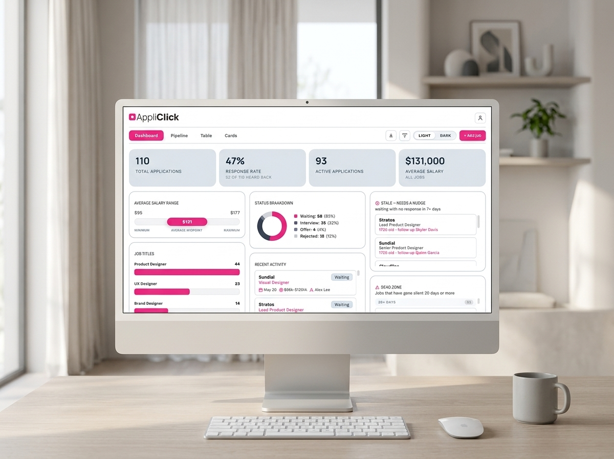
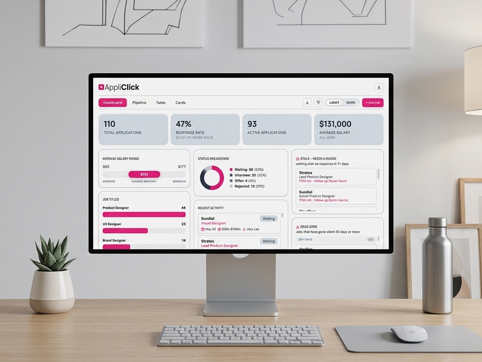
The dashboard gives users a fast overview of applications, response rates, active roles, salary ranges, stale applications, rejection patterns, and recent activity so they can understand their search at a glance.
Pipeline view for rapid workflow updates
Applications become draggable kanban cards, allowing users to quickly move roles between waiting, interview, offer, and rejected states without opening every entry individually.
Multiple viewing modes for different tasks
The table view enables spreadsheet-style editing and fast data entry, while card views are built for lighter scanning and review. Different modes fit different user behaviors without forcing a single workflow pattern.
Account-based persistence and continuity
User data is stored through authenticated cloud accounts, allowing users to return across sessions without losing application history, notes, salary details, or workflow state.
Iteration
Beta testing quickly exposed friction points in readability and workflow speed.
Early beta testing revealed that users needed faster scanability, stronger filtering, clearer hierarchy, improved mobile layouts, and reduced cognitive load during repeated daily sessions. Iteration focused on improving visibility, usability, and workflow speed without overwhelming the interface.
What changed
Search, filters, mobile layouts, card organization, dashboard hierarchy, status visibility, CSV import/export functionality, and dark mode were redesigned after real testing exposed friction points and weak areas in the workflow.
Why it mattered
The platform was not just storing data. It needed to help users feel oriented during an emotionally exhausting process with uncertainty, waiting, and constant context switching.
The product with both light and dark modes
Product Screenshots
AI-assisted development workflow
AI dramatically accelerated how the product was designed, tested, and built.
Appliclick was developed through a heavily AI-assisted workflow that combined product design, front-end implementation, debugging, responsive refinement, database setup, interaction logic, and rapid iteration.
Instead of treating AI as a novelty, the workflow used it as a collaborative development tool that made it possible to test ideas, refine layouts, solve technical problems, and move from concept to functional product significantly faster than a traditional solo workflow.
The project became an exploration of how modern AI-assisted development changes product velocity, iteration speed, and the relationship between design and implementation.
Rapid prototyping
AI-assisted workflows made it possible to move quickly from product ideas into functional layouts, interaction states, responsive behavior, and working feature tests without long implementation delays.
Design and implementation overlap
The workflow blurred the line between product design and development by allowing interface decisions, usability adjustments, debugging, and implementation changes to happen inside the same rapid iteration cycle.
Faster iteration loops
Because layouts, interactions, and technical fixes could be tested quickly, the product was able to evolve through repeated real-world use, beta feedback, and continuous refinement instead of long static design phases.
Reflection
Building a real product changes how design decisions get made.
Appliclick started as a response to a real workflow problem, but evolved into a fully functioning SaaS product with authentication, cloud persistence, multiple workflow views, responsive layouts, CSV import/export, dark mode, and active beta testing. Designing for real use forced every decision to become more practical. Features needed to fit repeated daily behavior, fast scanning, flexible workflows, and emotionally draining moments where users were already overwhelmed before opening the app. The project reinforced something I value deeply in product design. Interfaces only succeed when the workflow underneath actually helps people move forward.
PROJECT
Comprehensive Brand Refresh
Role
Lead Designer overseeing a scalable visual system, digital experience consistency, and cross-functional implementation throughout the refresh initiative.
Scope
Componentized brand patterns, UI treatments, typography, campaigns, social media, web surfaces, video, and repeatable design language across customer-facing experiences.
Impact
Established a repeatable visual system for cross-channel product and marketing surfaces, improving digital experience consistency and reducing one-off asset decisions.
Pain Point
After years of growth, CBT Nuggets looked fragmented across web, campaigns, video, and internal creative workflows. The work remained brand-led, but inconsistent patterns also affected the continuity of customer-facing digital experiences.
Different patterns across channels increased production effort and left customer-facing digital surfaces without a consistent visual vocabulary.
What Changed Through Iteration
I gathered stakeholder feedback, customer needs, design best practices, and usability gaps to distinguish preference from consistency issues. Rapid concepts helped leadership evaluate modernization against brand recognition. Once a direction was approved, I translated it into componentized patterns, typography, spacing rules, image treatment, and implementation guidance for web, campaigns, video, and internal creative workflows.
Through stakeholder review and implementation planning, reusable patterns were refined for consistent application across digital surfaces and internal creative workflows.
Outcome
The final system created a repeatable design language across web, social, campaigns, and video while preserving the brand-led purpose of the work. Teams gained reusable patterns for customer-facing surfaces and internal production, reducing the need to rebuild visual decisions for each new asset.
The result was a scalable visual system with shared patterns teams could apply across web, campaigns, video, and related customer-facing experiences.
Examples

Location
Las Vegas, NV
About
I design product UX and digital experiences that help people decide, act, and learn.
I am a Senior Product Designer with 11 years of experience across learner workflows, SaaS product work, customer-facing web experiences, and scalable visual systems. My work turns complex product requirements into navigable flows, useful interaction patterns, and interfaces that help users make informed decisions.
I work closely with research, product, development, and stakeholders to define information architecture, test product decisions, and carry patterns across product, web, and marketing surfaces. I am most useful when a complex workflow needs strong prioritization and a design team needs an implementation-ready direction.